
Zendesk box plot chart
eazyBI.com
Box plot chart
Box plot chart is a convenient way of graphically depicting groups of numerical data through their five-number summaries: the smallest observation (minimum), lower quartile (Q1), median (Q2), upper quartile (Q3), and largest observation (maximum).
eazyBI Zendesk import will create “Sample ticket resolution time range” sample box plot chart which will look similar to this:
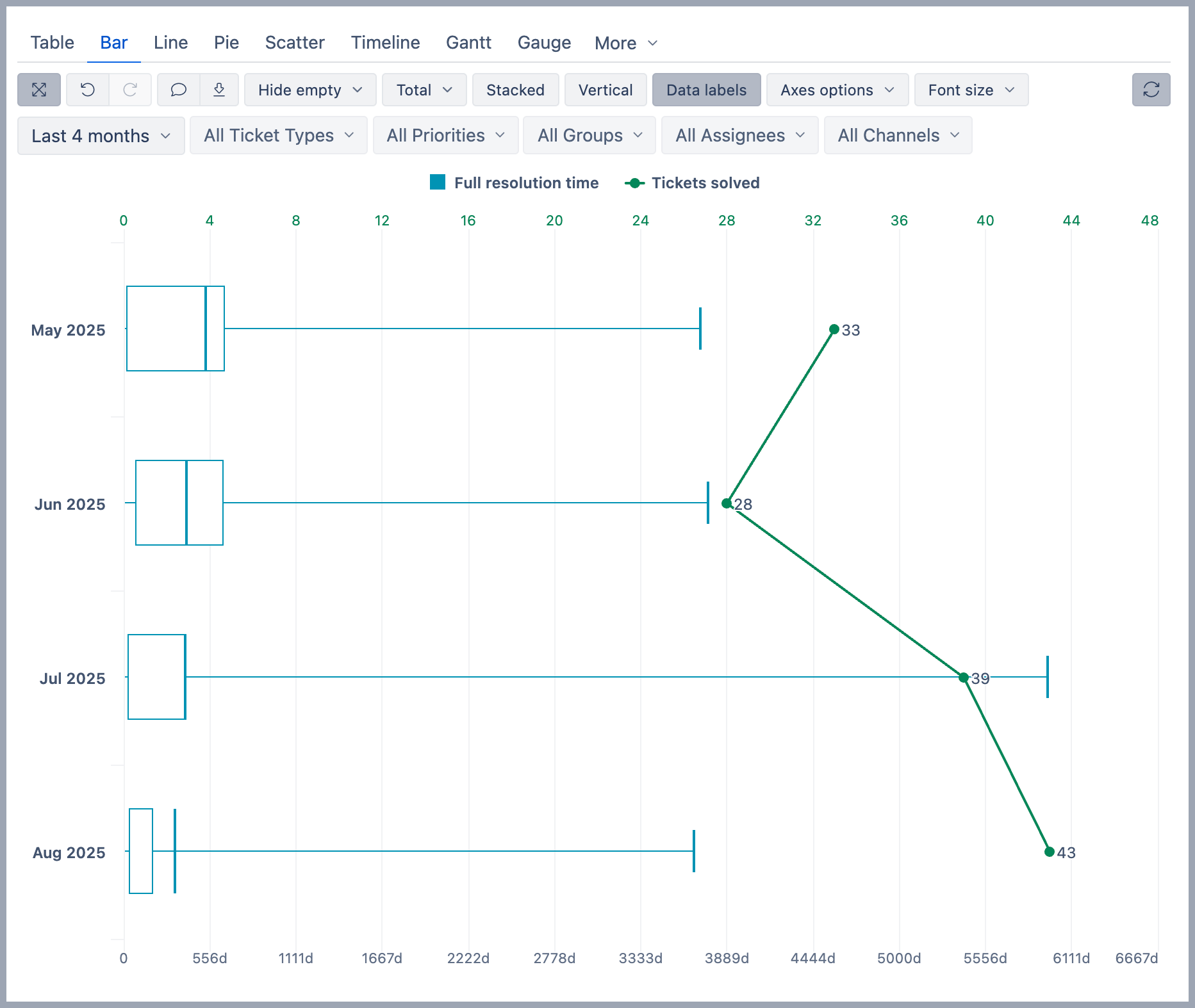
To create similar box plot chart you should do the following steps:
- Put Measures on columns and select measure you would like to analyze, for example, Full resolution time
- Put other dimension (e.g. Time) on rows and select necessary hierarchy level members.
- Click on column measure (e.g. Full resolution time) and select Add aggregate → All quartiles
- Click again on original measure and select Remove
- Change tab to Bar chart
- Click on color label of first measure (Min) in legend area and select Type → boxplot.
You should now see box plot chart of selected measures.