Create charts
eazyBI.com
eazyBI for Confluence
Private eazyBI
eazyBI for Jira
Charts in eazyBI help you visualize data from your reports to spot trends, compare values, and highlight key insights. Once you’ve built a Table report, you can switch to different chart views to present the data visually.
This page explains when to use each chart type and how to adjust chart options for clearer results.
If you’re new to reporting, start with the Create reports section first to learn how to build a report table before moving to charts.
On this page:
Chart types and options
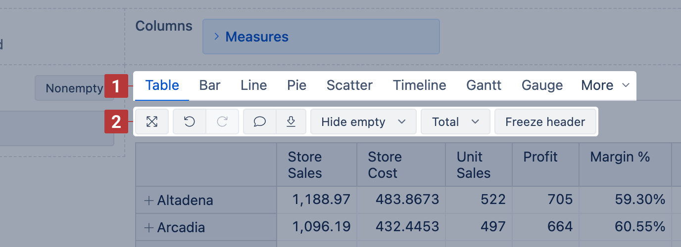
When creating a report, you'll see a Chart type selector [1] to switch between Table, Bar, Line, Pie, Scatter, Timeline, Gantt, Gauge, Radar, and Map charts to better visualize the selected data.
Each chart type has a set of Chart options [2] to adjust layout, formatting, and visibility.
Chart options common for all chart types:
- Maximize results view – expand chart, hide dimension sections
- Undo / Redo – revert or repeat recent changes
- Add description – add a description using Markdown
- Export report results – download as CSV, XLS, PDF, or PNG (for visual charts)
- Hide empty – hide rows/columns with no data
- Total – show row/column totals
Bar chart
Use the Bar chart [1] to compare data across categories using horizontal or vertical bars.
This chart is ideal when you want to:
- Compare values side-by-side (e.g., sales per store or issues per project)
- Highlight relative differences between grouped items
- Show part-to-whole composition using stacked bars
Use the Vertical option to switch from the default horizontal bars to vertical bars (columns).
Enable the Stacked option to split bars by category or status. You can then choose whether to show actual Values or Percentages within stacks.
Bar chart options [2]:
- Stacked – group values within each bar by row members
- Vertical – switch from horizontal to vertical bars
- Legend – show or hide the chart legend
- Values / Percentage – switch between absolute values or percentages (only with Stacked)
- Data labels – show values on the bars; with Stacked, switch to values, percentage, or both
- Axes options – adjust X/Y axis settings or Swap axes
- Font size – change chart font size (small, medium, large)
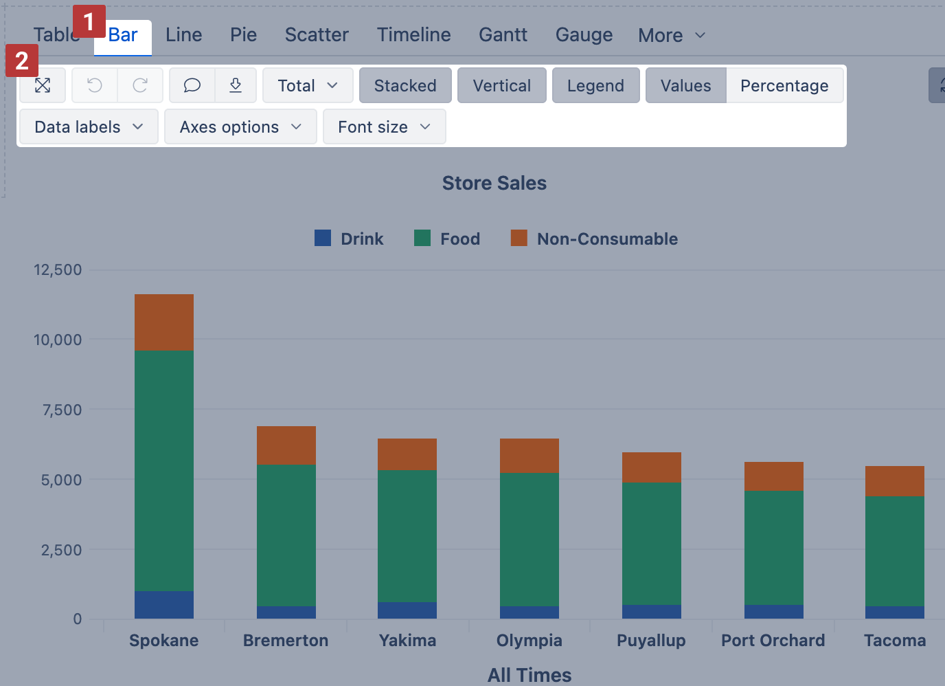
See the example: Product sales in select cities – shows a stacked bar view of product categories by city.
Line chart
Use the Line chart [1] to show trends over time or across ordered categories.
This chart is ideal when you want to:
- Track continuous data changes (e.g., weekly sales, monthly issue resolutions)
- Compare trends between multiple measures
- Emphasize peaks, drops, and progressions
Enable the Area option to highlight cumulative changes. This fills the space under the lines, making trends and volume easier to read.
Use Stacked (with Area) to group values by row members and show how parts contribute to a total.
Line chart options [2]:
- Area – fill the area under each line
- Stacked – group area values by row members (only available with Area)
- Legend – show or hide the chart legend
- Values / Percentage – switch between absolute values or percentages (only with Stacked)
- Data labels – show values at each point; with Stacked, switch to values, percentage, or both
- Axes options – adjust X/Y axis settings or Swap axes
- Font size – change chart font size (small, medium, large)
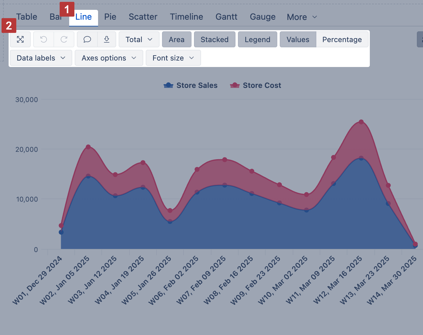
See the example: Product sales and cost by time – compares Store Sales and Store Cost weekly using an area chart with stacked values.
Pie chart
Use the Pie chart [1] to show how parts make up a whole. Each slice represents a proportion of the total, shown as values, percentages, or both.
Enable Relative size to scale each pie chart proportionally based on value.
You can enable the Donut option to compare the ratio of the segments between compositions. You can think of a Donut chart as a stacked bar graph that has been curled around on itself.
If you display data labels and percentages for each slice, you can hide the Legend for a cleaner look.
Pie chart options [2]:
- Donut – switch from a pie to a donut layout
- Legend – show or hide the chart legend
- Name labels – display names of each member
- Data labels – show values, percentages, or both inside slices
- Relative size – scale charts proportionally based on total value
- Swap axes – flip dimensions in rows/columns (when applicable)
- Font size – adjust chart font size (small, medium, large)
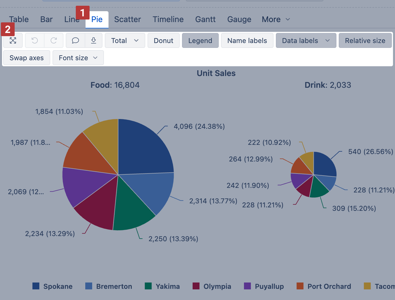
See the example: Unit sales by product family Top 40 – compares unit sales for two product families with relatively sized pie charts (top 40% slices)
Scatter chart
Use the Scatter chart [1] to explore relationships between two numeric measures. Each data point is placed using a separate measure for the X and Y axis, and the chart adjusts the axis scale automatically.
Enable the Bubble option to use a third measure for bubble size—this helps show how big or important each point is.
To zoom in, drag your mouse across the area you want to focus on.
Scatter chart options [2]:
- Legend – show or hide the chart legend
- Name labels – show member names next to bubbles
- Bubble – use a third measure to set the bubble size
- Axes options – adjust axis titles, label prefix/suffix, or min/max values
- Font size – change chart font size (small, medium, large)
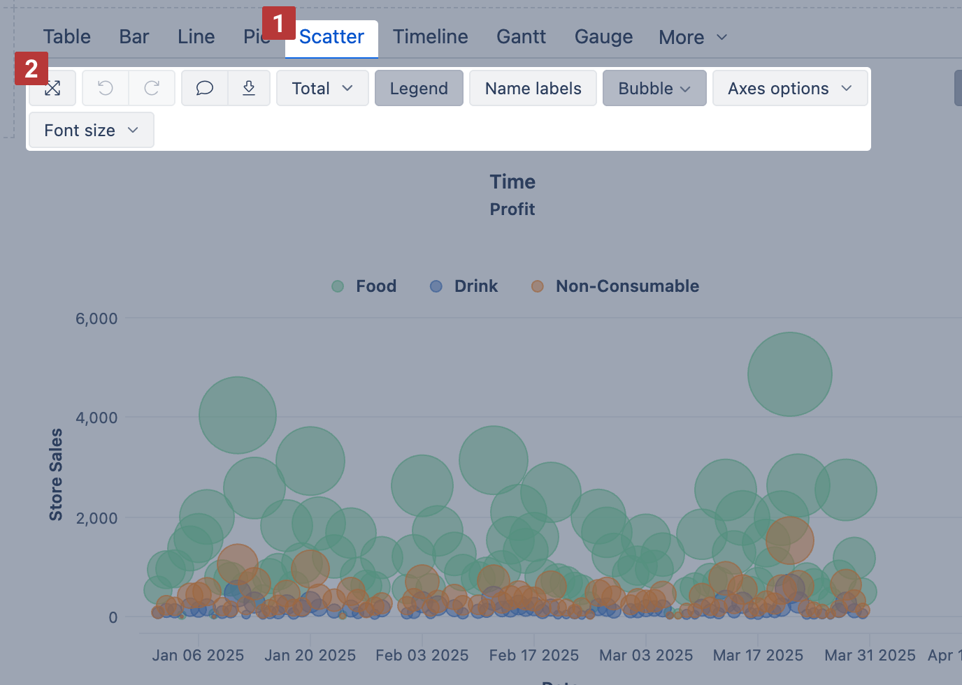
See the example: Scatter chart – Profit analysis – compares Store Sales and Time across product categories, with Profit shown by bubble size.
Timeline chart
Use the Timeline chart [2] to show continuous data changes over time. It works like a line chart but connects data points across time, even if some time periods have no data.
Start by placing the Time dimension [1] on rows (selecting the desired hierarchy like year, month, or day) and measures on columns. Then switch to the Timeline chart [2] to customize the chart display.
Show values as lines, splines, columns, or areas—whichever fits your data best.
To focus on a time range, drag across the chart to zoom in. To change the period shown in the report, apply a Time filter instead (which saves the filter selection).
Timeline chart options [3]:
- Line / Spline / Column / Area – switch how all measures are displayed
- Legend – show or hide the chart legend
- Stacked – group area values by row members (only with Area)
- Values / Percentage – switch between absolute values or percentages (only with Stacked)
- Data labels – show values at each point; with Stacked, switch to values, percentage, or both
- Axes options – adjust Y axis title, label prefix/suffix, or min/max values
- Font size – change chart font size (small, medium, large)
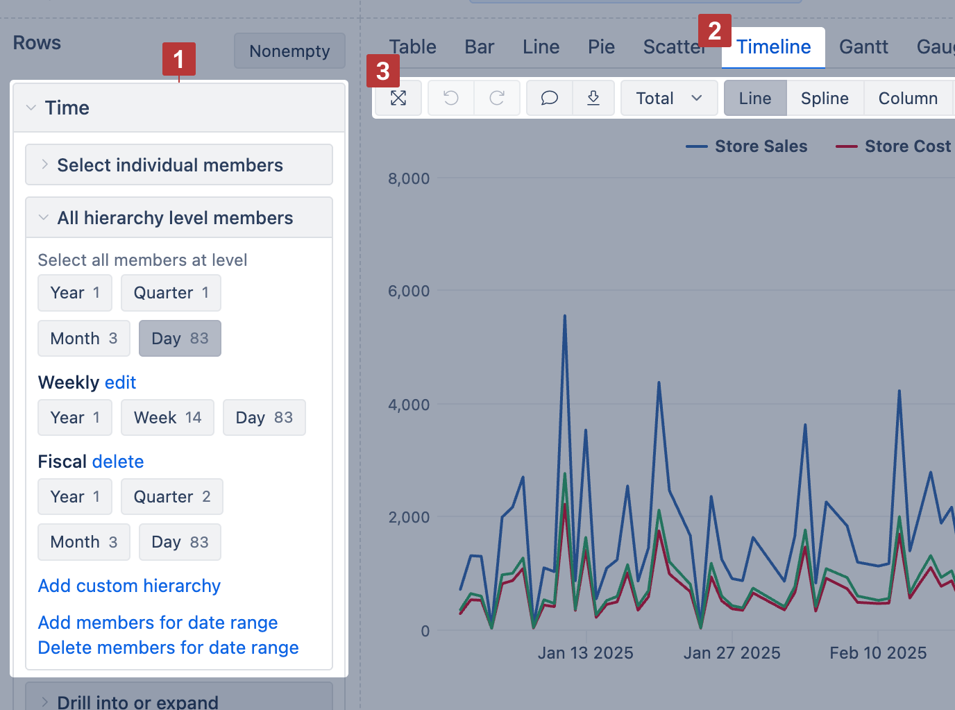
See the example: Timeline – Sales trend – compares several measures over time using line display.
Gantt chart
The new Gantt options are available on Cloud and since eazyBI version 8.2.
Use the Gantt chart [1] to illustrate scheduled tasks and their progress on a timeline. The timeline can be displayed in various granularities: Daily, Weekly, Monthly, Quarterly, Yearly, or Fit width [2].
To build a Gantt chart, place projects or tasks on rows and select at least two date measures [3] in columns:
- Start date – set it as the first column;
- End date – set it right after the start date column.
A bar connects the start and end dates on the timeline. If the start date is missing, the end date is marked with a diamond.
Additional Columns:
- Progress [4]: You can add a percentage measure (%) to the report to automatically display the completion progress on the task bars. If the value is below 100% and the end date is in the past, the task will appear as overdue.
- Milestones [5]: You can add other date measures to the report. In the Gantt options [6], enable their display as milestones.
Drag the vertical separator [7] to adjust the size of the table.
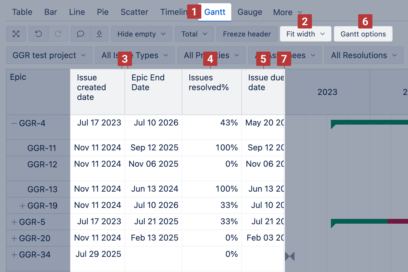
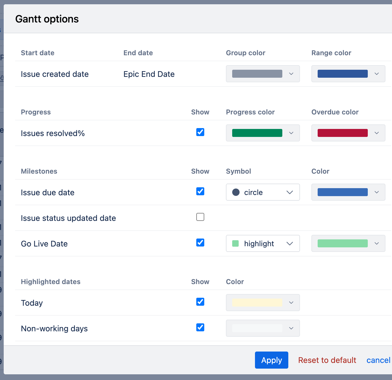
Gantt options to adjust the chart appearance:
- Group color: Applied to parent tasks. The entire parent bar is shown in this color, or the unfinished part if the progress (%) is set.
- Range color: Applied to standalone tasks (without a parent) and child tasks, coloring the entire bar or the unfinished part if progress (%) is set.
- Progress color: Shows the completed portion of a task according to its progress (%). For example, if progress is 50%, half of the bar is filled with this color.
- Overdue color: Overrides other colors if a task’s end date is earlier than today. The unfinished portion is shown in this color.
- Milestones: Use the "Show" option to display milestones, selecting a symbol and color for each. The "highlight" symbol displays a milestone as a vertical line, useful for fixed dates across all groups.
- Highlighted dates:
- Today: Show the current day on the chart with a selected color.
- Non-working days: Display non-working days (based on the Time dimension import options) with a selected color.
See the example here: https://eazybi.com/accounts/1000/cubes/Issues/reports/4261841-issue-epic-gantt-chart-with-milestones
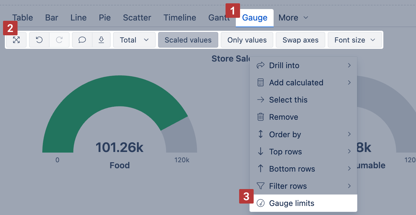
Gauge chart
Use the Gauge chart [1] to visualize key performance indicators (KPIs) as color-coded gauges showing progress towards defined limits.
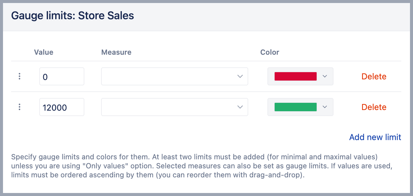
Set Gauge limits [3] to define value ranges and colors.
- To apply limits for all gauges, click the measure name and select Gauge limits
- To apply limits to a specific gauge, right-click the value label and set Gauge limits
Gauge chart options [2]:
- Scaled values – shorten large values (e.g., 4.2k, 1.2M)
- Only values – display numbers without gauge arcs
- Swap axes – switch dimensions between rows and columns
- Font size – change chart font size (small, medium, large)
See the example: Gauge chart – Beer and wine sales gauge – displays beer and wine sales using gauge limits and scaled values.
For Gauge limits, you can enter:
- Exact values or percentages (use k, M, or % suffixes)
- Another Measure as the limit (must be added to columns)
- For Sparkline styling, select a color without entering a value
To adjust the view, use chart options like Only values [4] or Scaled values [5] to show numbers alone or with k/M suffixes (e.g., 4.2k, 1.2M).
You can also add a Sparkline to show a brief trend next to the number.
Use Only values with a Sparkline for compact metric overviews; use full gauges to emphasize thresholds or targets.

See the example: Gauge chart – Drink and Food sales – shows Store Sales as values with sparklines for trends, using scaled values.
Radar chart
Available on Cloud and since eazyBI version 8.1.
Use the Radar chart [1] (also called spider or web chart) to compare multiple measures across dimension members using the same scale. It’s great for spotting patterns, trends, or outliers in a compact visual layout.
You'll find the Radar chart in the More section.
You can display values as a line or an Area. For Area charts, enable Stacked to show cumulative composition.
Radar chart options [2]:
- Area – fill the area under each line
- Stacked – group area values by row members (only with Area)
- Legend – show or hide the chart legend
- Data labels – show values at each point; with Stacked, switch to values, percentage, or both
- Axes options –adjust Y axis label prefix/suffix, min/max values, or Swap axes
- Font size – change chart font size (small, medium, large)
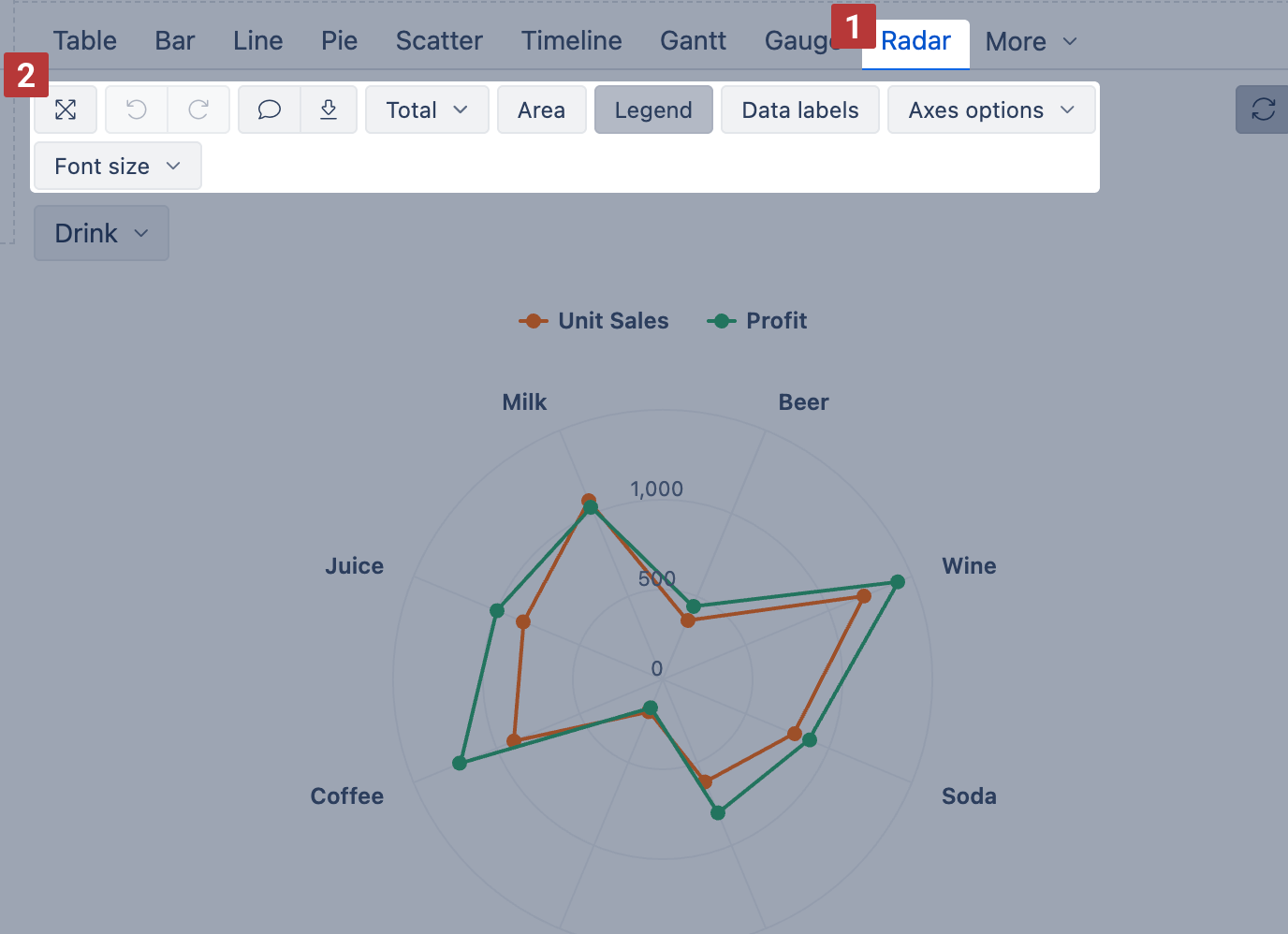
See the example: Radar chart – Sales and Profit by Drink – compares Unit Sales and Profit across drink categories.
Map chart
Use the Map chart [1] to visualize data geographically—either by country/region (Static map) or by coordinates (Dynamic map). It's ideal for displaying values like population, sales, or activity counts across locations.
You'll find the Map chart in the More section.
You can choose between two map types:
- Static map – regions colored by value intensity by country/region name or ISO code
- OpenStreetMap – bubble markers based on latitude/longitude coordinates
See the examples: Population and Airports dashboard – shows both static and dynamic map types side by side.
Static map
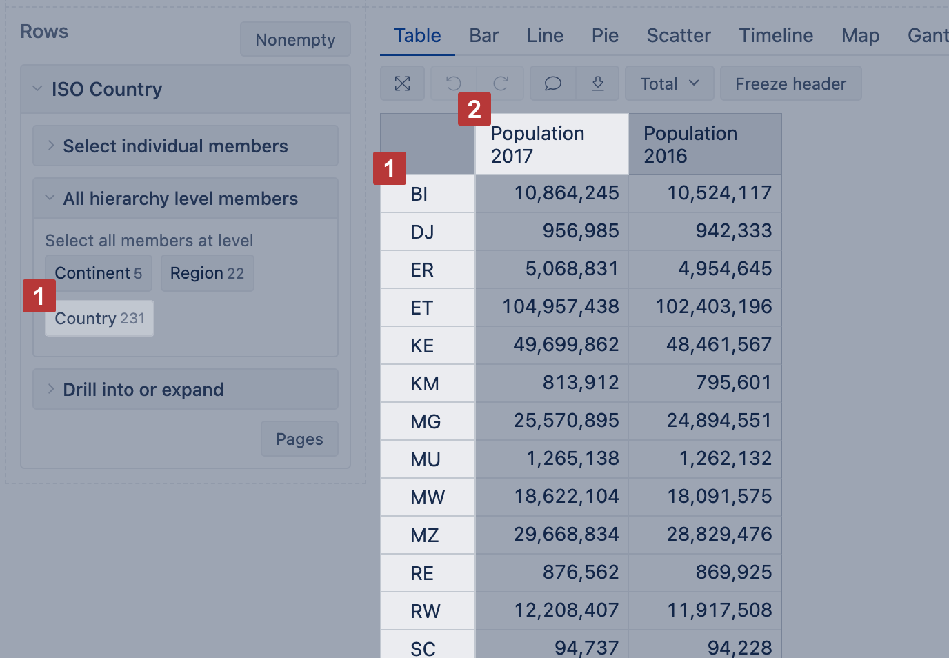
Use a Static map when your data includes countries or regions mapped by their ISO two-letter codes or recognizable country names. This map displays regions using shaded color intensity based on the first measure value.
Building a Static map:
- Select a dimension with countries or regions [1] (e.g., ISO Country) on Rows
- Add one or more measures on Columns
- The first column [2] determines the shading intensity for each region
- Use additional columns to display more data in hover tooltips
Next, switch to the Map chart [1] view and select Static [2] from the map type options.
The selected measure [3] from the first column will be used to calculate the color intensity for each region—darker shades represent higher values. To show or hide selected measurs name, choose Legend.
You can also use the Select map [2] dropdown to switch between available maps (e.g., world, continent, or country view). When hovering over a region, you'll see values from all columns.
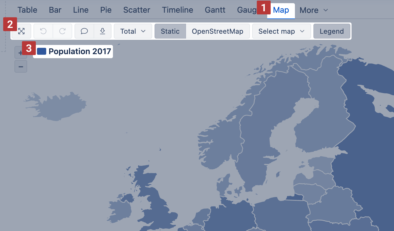
See the example: World population 2017 by countries – Static map – shows population by country with region shading.
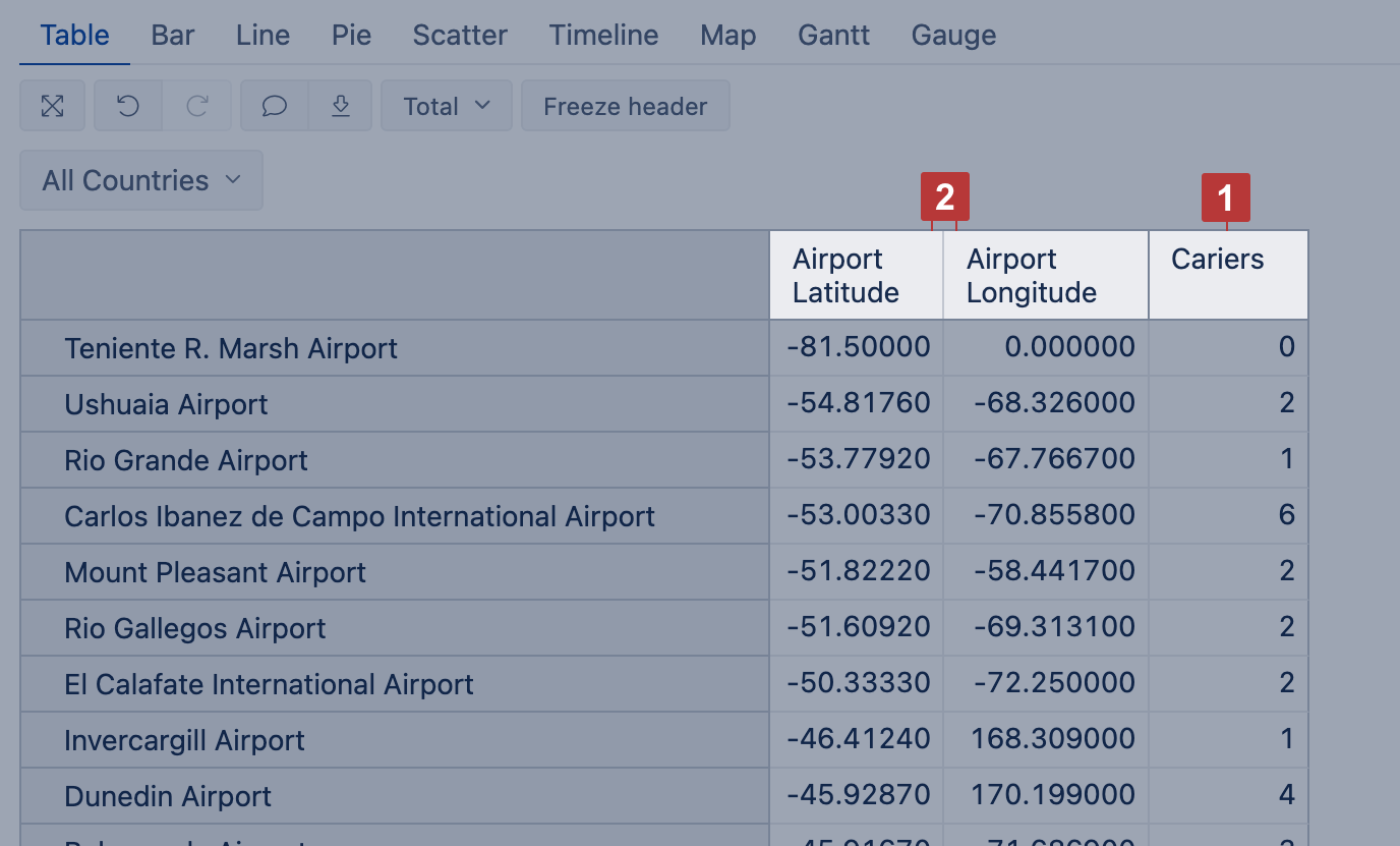
Dynamic map
Use the OpenStreetMap view when your dimension members have latitude and longitude values for precise point-level mapping (e.g., airports, stores, offices).
This map type is ideal when your data doesn't reference standard country names but instead has precise location coordinates.
Building a Dynamic map:
- Add a dimension containing the objects you want to display (e.g., airport names) on Rows
- Add coordinates and a measure to Columns:
- The first column should contain latitude
- The second column should contain longitude [2]
- Add a numeric measure [1] in a third column or as a filter to provide context for each point
Then switch to the Map chart and select the OpenStreetMap view to see the number of objects (dimension members) in each region.
You can zoom in, pan around the map, or click on the number bubbles to focus the view on a specific region. Hovering over the individual pins will display values selected in the report.
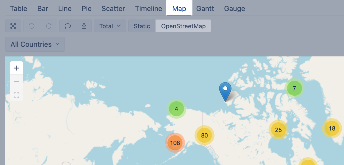
See the example: World airports – Dynamic map – shows airport data on a global map using coordinates.
Training videos
Learn more by checking out these training videos:
- Displaying report data in charts helps to perceive the message of the report at a glance. Start with a timeline chart and learn how to customize it! Episode 4: Using charts - part 1
- Different data calls for different charts. A quick overview of frequently used chart types. Episode 5: Using charts - part 2
- more details on specific chart types Videos: data visualizations